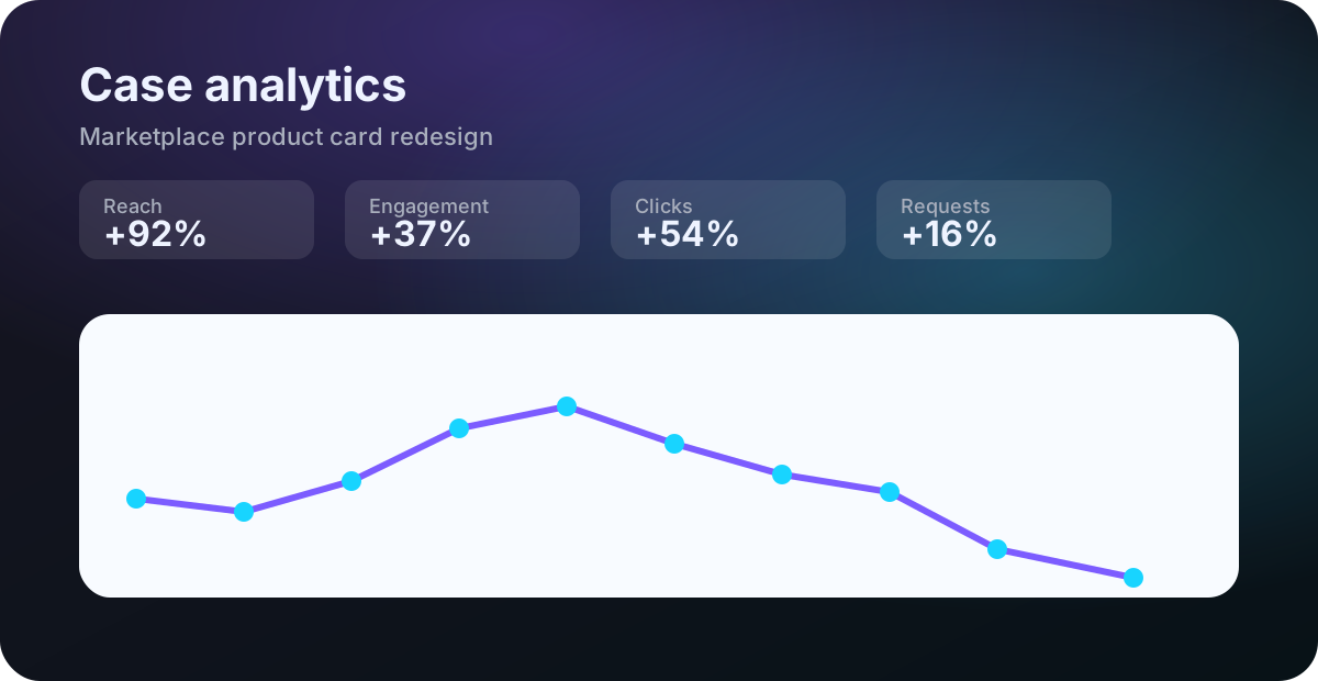
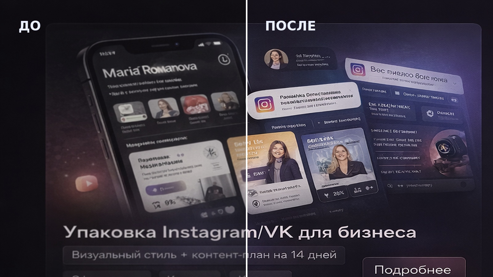
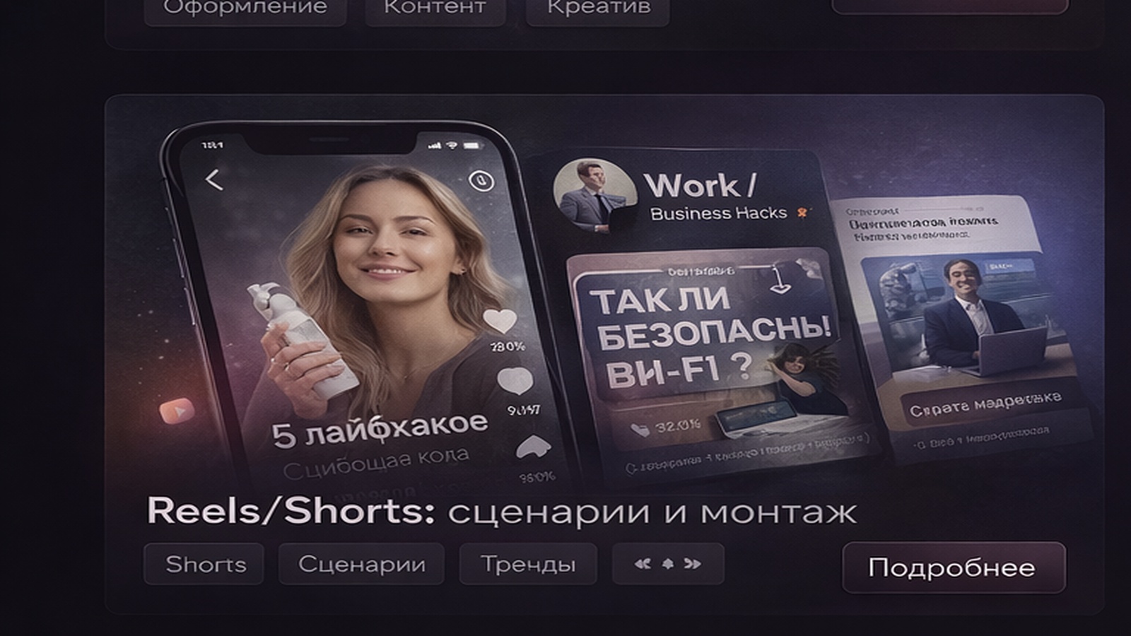
A card wins not by being “pretty”, but by helping a buyer understand in 2–3 seconds:
what it is and why it’s worth it. Here’s a fast checklist that usually improves clicks.
Fix #1: One main headline.
If you have 3–4 headlines, attention splits and people leave.
Fix #2: A benefit in a number/fact.
“Top quality” is vague. Use specifics: warranty, material, set contents, delivery time.
Fix #3: Mobile readability.
Increase font size, avoid thin weights, test on a dark background.
Fix #4: 3–5 strong benefits, not 10.
Less text, more impact.
Fix #5: “Anti-clutter”.
Fewer decorative frames/labels — more clean space.
Fix #6: Consistent style & spacing.
Aligned margins instantly look more premium.
Fix #7: One clear next step (CTA).
“Choose size / See the set / Order” — short and obvious.
Send your product + competitors — I’ll propose a structure and visual style.